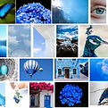
Welcome
HueVibes
May 2023
Branding Design
(Braille with color)

Welcome to HueVibe, the brand that challenges the traditional way of experiencing colors. HueVibes wants to guide people to a more comprehensive understanding of color through senses other than sight. By providing blind or visually impaired people with a tool card that allows them to experience color through senses other than sight, it provides a unique and valuable experience. We hope that HueVibes' color cards will evoke emotions about color and connect with the world in a deeper, more meaningful way.


Project Introduction
The following is a detailed description of this project, including the production process of HueVibes and the research direction.

Part 1. Brainstorming
The inspiration for this project
Part 2. Research
The study of color in psychology

Part 3. Experience with color
Experimenting with painting to experience color

Part 4. Logo Design
Trying to implement the idea in a project, starting with naming and making a logo

Part 5. Cards Design
Determine the display style and create the Color cards

Part 6. Peripheral Design
Create designs to make the brand more complete
Part 1. Brainstorming
At first, I just wanted to create a project related to color, and the works of the following three artists are among those that I have seen and liked very much. Their works gave me a strong visual impact, and when I saw them, I felt very relaxed. These works are all composed of very beautiful colors. So, I started to wonder how colors can affect people's moods and what the connection between colors and psychology is.
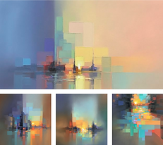
Paintings by: Jason Anderson
Jason Anderson started his art life with became a glass apprenticeship, this is also the source of inspiration for many of his paintings. As Jason said “This creates two experiences… from a distance, it’s a scene – but up close it’s all about the shapes and color.” He gives people a chance to imagine things, and the color palette of the paintings is very harmonious.
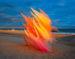
Tulle no. 34_v1
This piece was made by artist Thomas Jackson. From the intersection of landscape photography, sculpture and kinetic art, Thomas Jackson draws on the forces of nature to make his tulle installations appear in different states under the action of the wind.
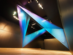
Plexus no. 31
This is Gabriel Dawe's artwork using threads at the Newark Museum, where Gabriel used thin threads to create shapes of light in an indoor environment.
(https://www.gabrieldawe.com/plexus-no-31/z59uyu6j276o7gc4kx9b9ekosutfw6)
Part 2. Research
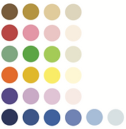
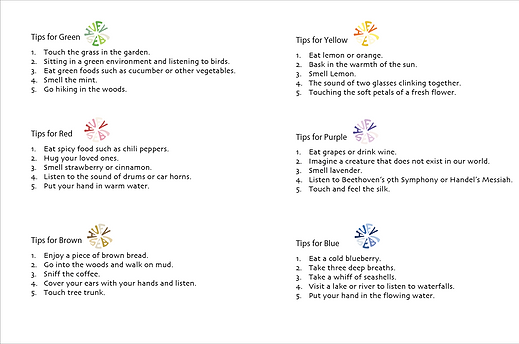
Due to time constraints, I decided to start with blue, red, yellow, green, purple, and brown. Through research, I gave them a relatively brief definition because I knew that everyone perceives colors differently and has their own associations, which may not work for everyone in the same way. It is important to note that color associations can vary depending on cultural and personal contexts, so not everyone will have the same associations with different colors.
Through more than two weeks of research and investigation, I learned that each color has a comprehensive study in psychology. Colors have the power to uplift and incite, as well as relax and soothe.
Too much yellow can trigger frustration, too much red can raise blood pressure, while light blue tones soothe breathing and bring a sense of calm, and dark blue tones can be sad. Scientists have proven that light outside the visible spectrum affects our physical state, which is why light therapy can treat skin conditions like jaundice and psoriasis.
Red: heat, warm
Yellow: positivity, vitality, induce appetite, happiness
Green: vitality, luck, relaxation, comfort
Blue: ideal, independence, freedom, calm
Purple: tranquility, mystery
Brown: stability, peace, kindness
(Note: this understand might be different for everyone)
Part 3. Experience with Color
 |  |  |
|---|---|---|
 |  |  |
 |  |  |
 |  |  |
 |  |  |
Drag to see my color experience paintings.
While studying color and psychology, I randomly picked colors to paint each day based on my mood at the time. During this process, I found that blending colors gave the painting a relaxed and natural feeling. When I chose tinted colors in the same color family, the painting looked visually clean and comfortable. Based on this, I created a painting for each of the six colors I had chosen. Since my initial drawings were all digital, they inevitably looked stiff. In this case, I decided to use gouache to paint the six digital drawings. Then, I scanned the paintings into the computer to capture that physical organic texture.
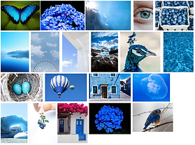
 BLUE |
|---|
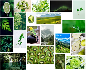
 GREEN |
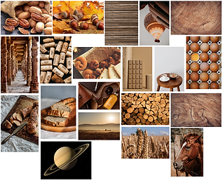
 BROWN |
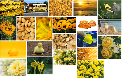
 YELLOW / ORANGE |
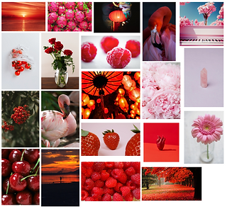
 RED |
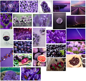
 PURPLE |
Part 4. Logo Design
Once I had done some research on color, I started thinking about how to implement my ideas. So I decided to start with a brand name and logo. On the right are some of the brand names I had in mind, and HueVibes was my final choice.
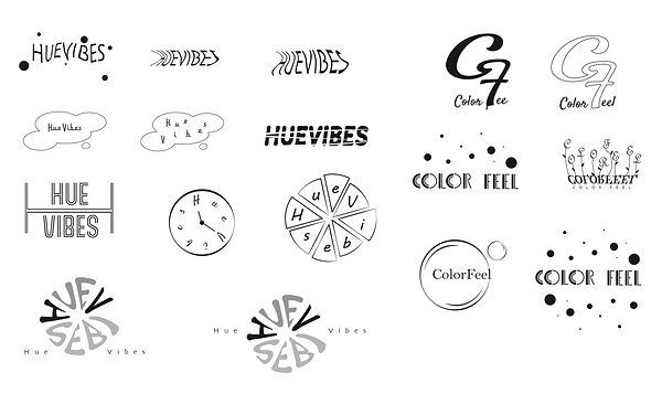
( Logo Sketches )

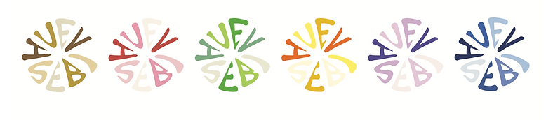
The final logo was inspired by the look of water dropping onto paper and the look of the pupil. Since I wanted a logo that felt clean and natural, I tried to combine letters and shapes. Since the letter "H" and the letter "V" are capitalized in the logo, I set them as the two darkest letters in the logo, while the other letters are in the same color tints. Then, I combined the logo with the six colors I had chosen to get the final look of the logo.
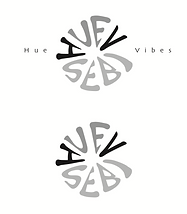
( Final Logo )
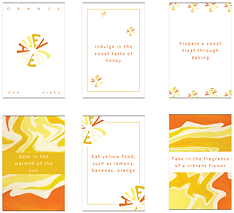
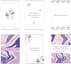
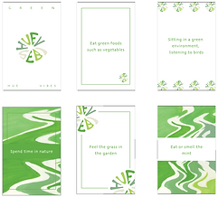
Part 5. Cards Design
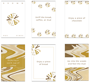
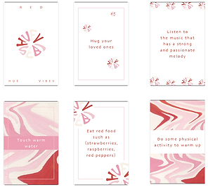
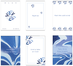
After the logo was created, I started to create the color cards. Firstly, based on my previous research on color, I selected five activities that were most likely to make similar associations for the vast majority of users, allowing them to feel color through smell, hearing, touch, taste, and physical activity. Based on these five directions, I developed five different color perception activities for each color. Since everyone may have different interpretations of colors, I created blank cards for each color, which users can personalize by writing down their own interpretations or feelings about the color to create their own color box.
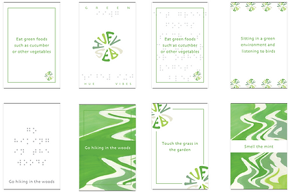
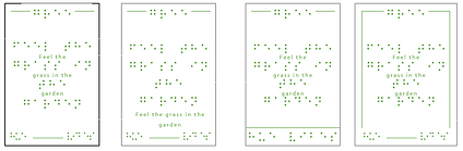
I wanted my cards to look clean and pleasant, but not boring. So I decided to design a different background for these cards and users would have a unique experience with each card. I added a simple outline of the corresponding activity to the top of each card to make it easy for users to identify which sense the activity is associated with. Finally, I added the name of the color at the backside of the card to help users remember the color name and connect it with their personal interpretation.
For individuals who are blind or visually impaired, feeling color through senses other than sight can provide a unique and valuable experience that may not have been possible before. It can help them understand and appreciate the world of color in a way that is accessible and meaningful to them.
So I also provide tool cards for the blind or visually impaired to incorporate Braille into the design. During my research on Braille pairs, I learned that the font size of Braille cannot be smaller than size 19, which means that the Braille text will appear larger than other words.
Integrating Braille into my project was a great challenge. Initially, I wanted to create two separate sets of cards, one for clients with normal vision and one for those who are blind or visually impaired. However, producing two sets of cards would take more time and cost more.
Integrating Braille into my project was a great challenge. Initially, I wanted to create two separate sets of cards, one for clients with normal vision and one for those who are blind or visually impaired. However, producing two sets of cards would take more time and cost more. So, I started experimenting with combining Braille cards with regular color cards, made a few different types of cards, and then conducted a small research study. I was worried that combining the two sets of cards would affect the readability of the cards for users without visual problems. The results showed that the vast majority of people thought that the combination of Braille and regular cards did not affect the readability of the cards, and that the addition of Braille added a sense of mystery to the cards.
Final Cards Design


Part 6. Peripheral Design
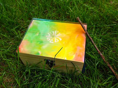
After designing the color cards, I started thinking about how to make the brand presentation more complete. So, I designed the packaging, brochure, poster, and guide for the cards. The packaging was designed with a blurred color palette and the logo on the front, and the transparent material of the packaging revealed the pattern of the bamboo box inside, giving the product a more breathable appearance.
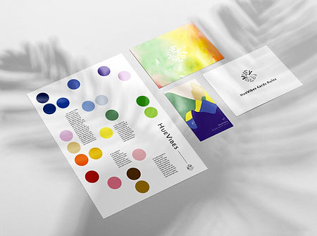
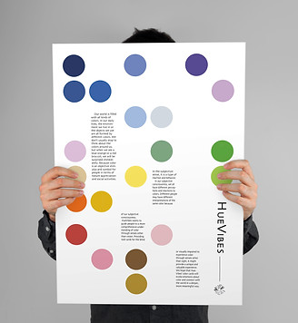
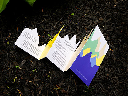
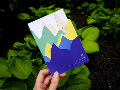
The brochure features graphics are from the previous paintings and is stacked sequentially to resemble a mountain peak. I wanted to create an immersive experience that would transport people into nature through the activity of these cards, allowing them to feel the world through the guidance of colors. The poster design was inspired by Braille; I converted the HueVibes brand name into Braille and arranged it in sequence on the poster, blending it with the brand's color palette.
Colors can evoke different emotions and moods, communicate messages and meanings, and even affect our behavior and decision-making. For individuals who are blind or visually impaired, feeling color through senses other than sight can provide a unique and valuable experience that may not have been possible before. It can help them understand and appreciate the world of color in a way that is accessible and meaningful to them. I believes that feeling color is important because it allows people to connect with the world in a deeper and more meaningful way.